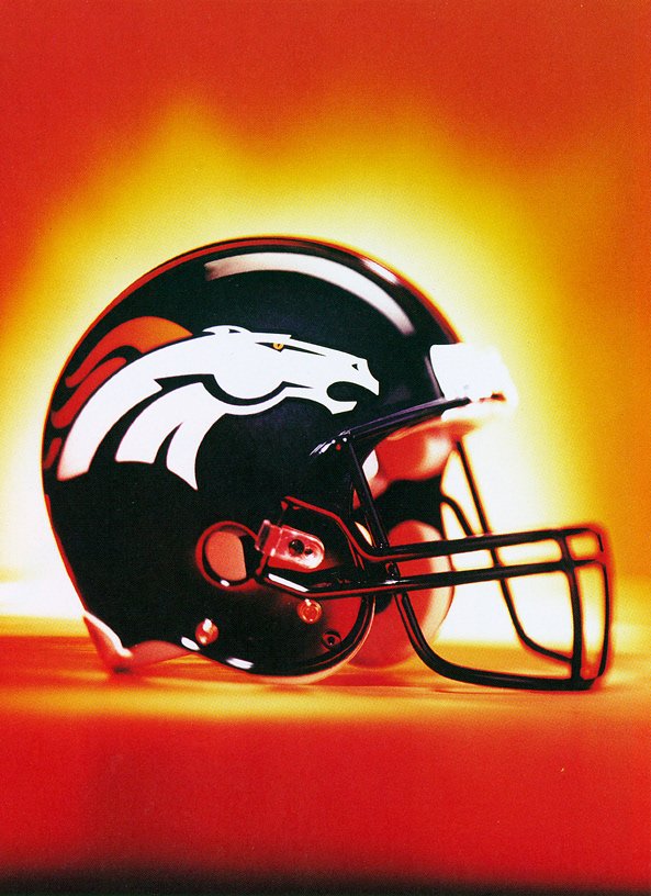
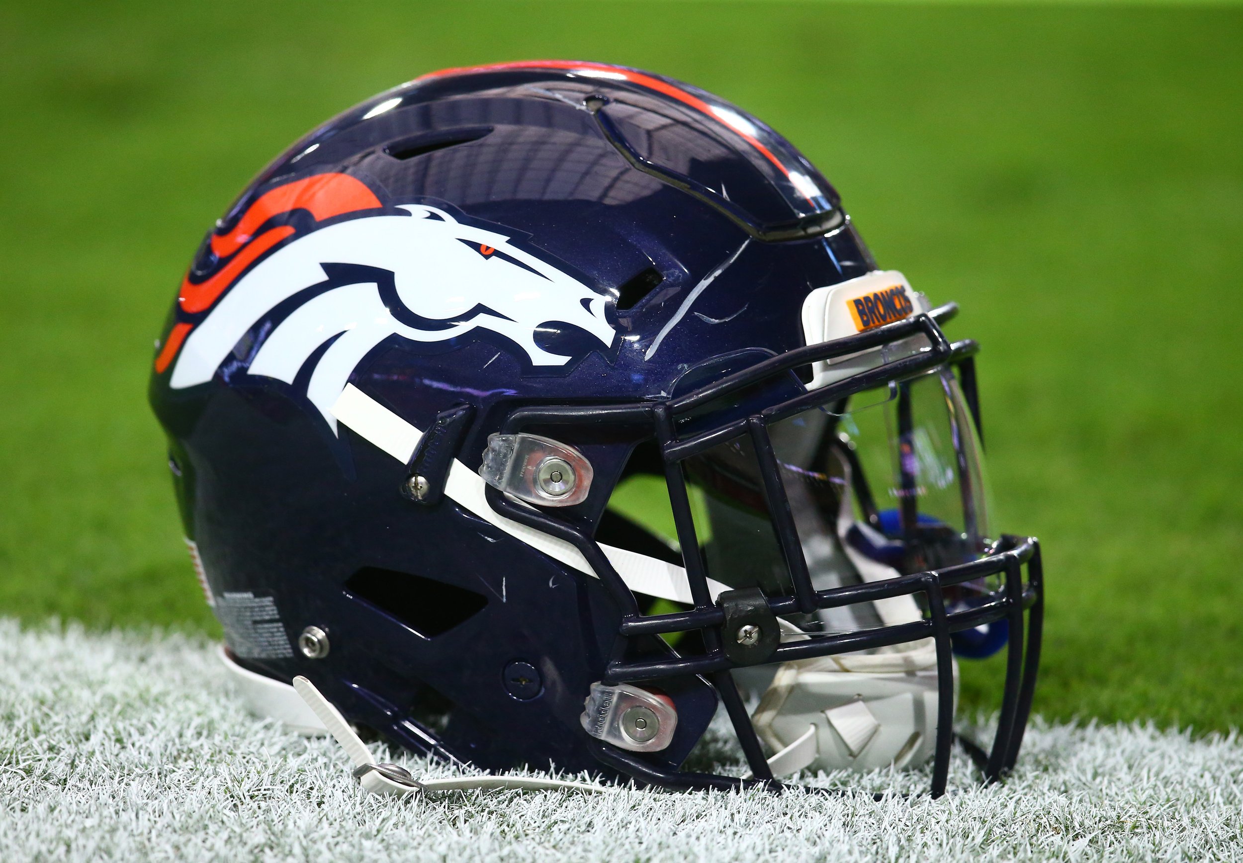
In 1996, Denver Broncos owner, Pat Bowlen went outside the NFL seeking a new identity for his team. He was friends with NIKE CEO, Phil Knight. He mentioned to Knight that he wanted a horse that was a swoosh. He wanted a horse that "looks like it's going to kick your ass".
Over several months we dove deep into the story of who the Denver Broncos were and who they wanted to be. This is a visualization of the design process that brought their story to life.
The first part of the redesign involved a full month in discovery mode. We were granted access to the NFL's Hall of Fame archives where we were able to look through the Bronco's entire history.
We uncovered a Native American legend of a ghost horse of the plains. The horse was so spirited, it couldn't be tamed by man. We started exploring other uncontrollable forces in nature like volcanoes, tsunamis and other animals like serpents.
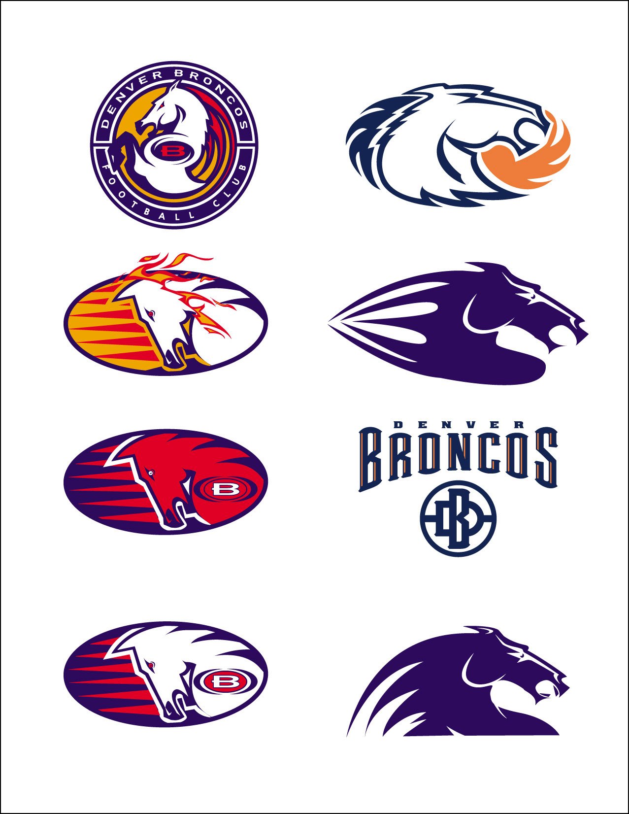
When we finally sat down to start sketching, you can see some of the early inspirations represent serpent elements and wave type shapes.
We tightened up the story around the purpose of orange in the color scheme. Orange represents the fiery belly of the stallion, which is why the eyes ended up becoming orange. They're the windows to his soul.
This was the first version we presented to Pat Bowlen and the Denver Broncos' front office. We felt pretty good about where we had gotten to, but it was only one of four rounds of development. This was after about three months of design works and color exploration.
It was around this stage in the process we started honing in on the idea that a horse's strength comes from its neck. We had been going down a path focusing on uncontrollable forces of nature to this point, but then we started turning some of those wave shapes into highlighted neck muscles.


