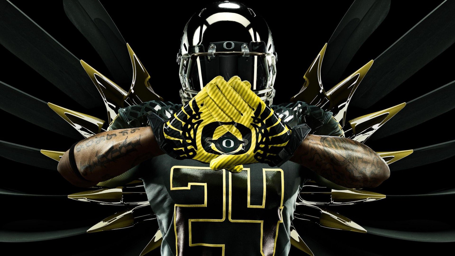
“We have one of the most recognizable college brands in the nation.”
- University of Oregon
Reimaging the Ducks: A Pacific Coast Brand Story
Picture this: the University of Oregon, perched on the edge of the Pacific, buzzing with students from across the globe, especially Asia and Hawaii. That's the backdrop for our project – a mission to refresh the U of O brand, weaving in its unique location, cultural touchstones, and a bold vision for the future.
We dove deep, soaking up inspiration from bullet trains zipping through Japan and Nike's constant push for athletic innovation. The idea was to link the University's identity with both tech and sports – a natural fit, right?
Then, lightning struck (well, not literally, but you get the idea). Lunch break near the Nike campus, staring at a mallard strutting its stuff. Its iridescent head got me thinking – wasn't there that amazing color-shifting Chroma-Flair paint we saw at the Detroit auto show?
Voila! Iridescent greens and a vibrant yellow bloomed, the perfect color combo to capture the energy of the U of O. But wait, there's more! The logo was tricky. We didn't want to ruffle any feathers (pun intended) with brand trademarks, so we went back and forth between "UO" and just an "O."
Finally, after late nights and countless iterations, it hit me on a Friday night (don't we all love those?). The iconic curves of the Oregon track and the unmistakable footprint of Autzen Stadium – what if we merged them? Boom! The "O" you see today was born, perfectly representing the University's athletic legacy and geographical roots.
And the story doesn't end there. We teamed up with design rockstars like Tinker Hatfield, Tracy Teague, and David Turner. Think iridescent green logos meeting futuristic uniforms – a complete head-to-toe transformation designed to attract top talent and propel the U of O into the future.
So, there you have it! A brand refresh that's as vibrant and innovative as the Ducks themselves.

